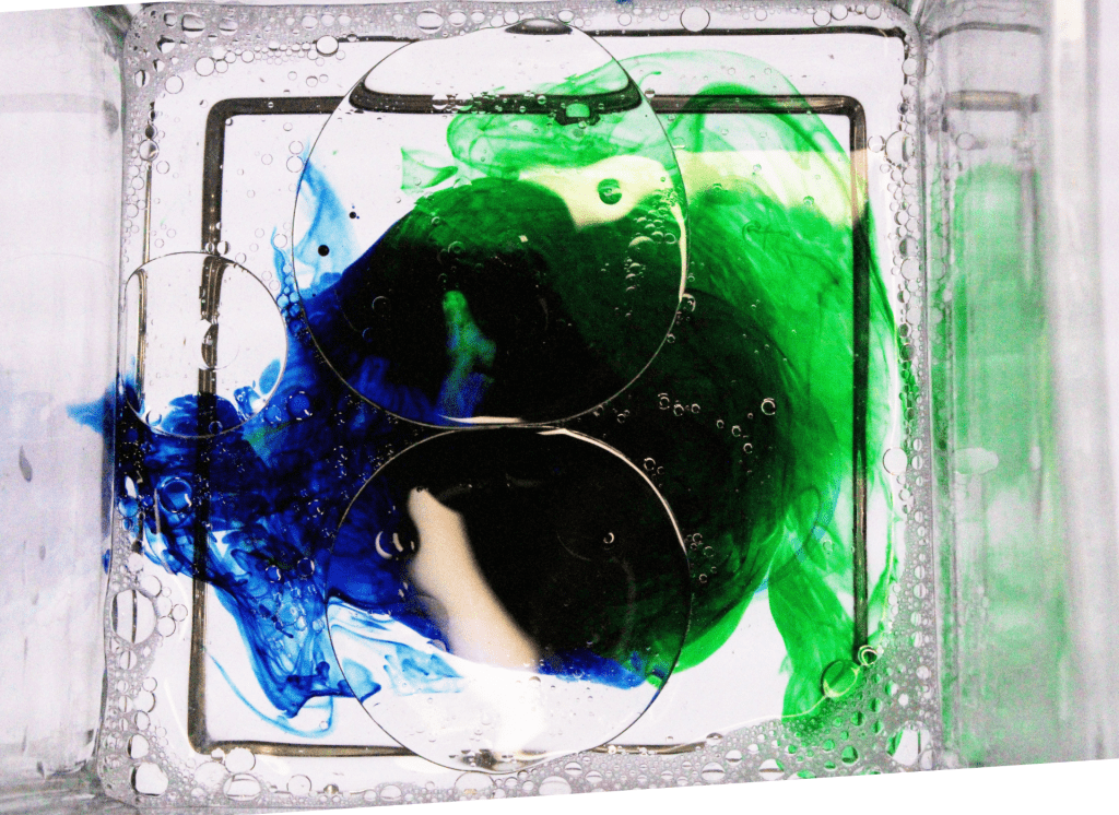
a. What is the distinct mood of the photograph? Explain.
The mood of the oil and water photograph is kind of uneasy. I wanted the green and blue to come together and look like they’re fighting. The colors of blue and green kind of give a creepy feel to it.
b. What does the photo make you think about? Explain.
In my post with the oil and water I wanted it to make you feel like two things were clashing. In this photo the green and blue look like they’re fighting.
c. What in the photo jumps out at you? Explain.
The bright green really stands out. You go from looking at the dark blue to looking at very bright green.
d. How does the photo make you feel? Explain.
The photo makes me feel kind of angry. The blue and green are clashing together. This kind of gives a war vibe.
e. What advice would you give to next year’s students for shooting abstract photography? Explain.
I would tell next year’s students to make sure you get the right photo. You don’t want to settle for a photo that you don’t want. You have to really give thought to the type of picture you want.
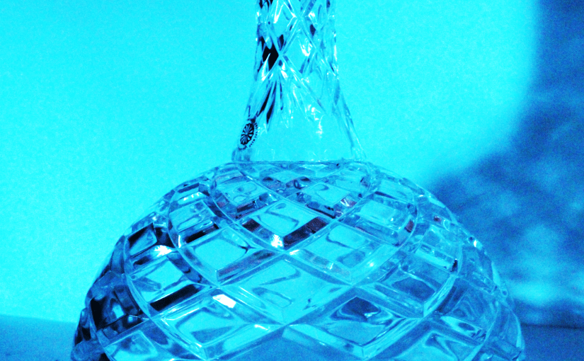
I like how unique the refraction picture is. The picture chosen for this subject gives off a certain mood that is gloomy and mysterious. This object in this picture is also perfectly centered, showing symmetry, which is pleasing to look at.
The photographer ought to show a little calmness and patience, in my opinion. Because some of the photos are blurry, you can tell the photographer is not. They would get much better if the photographer took his time to get a flawless, still shot.
Still, no photograph is faultless. There seems to be some blurriness in the photo. The image would be better if the photographer had held the camera a little more motionless.
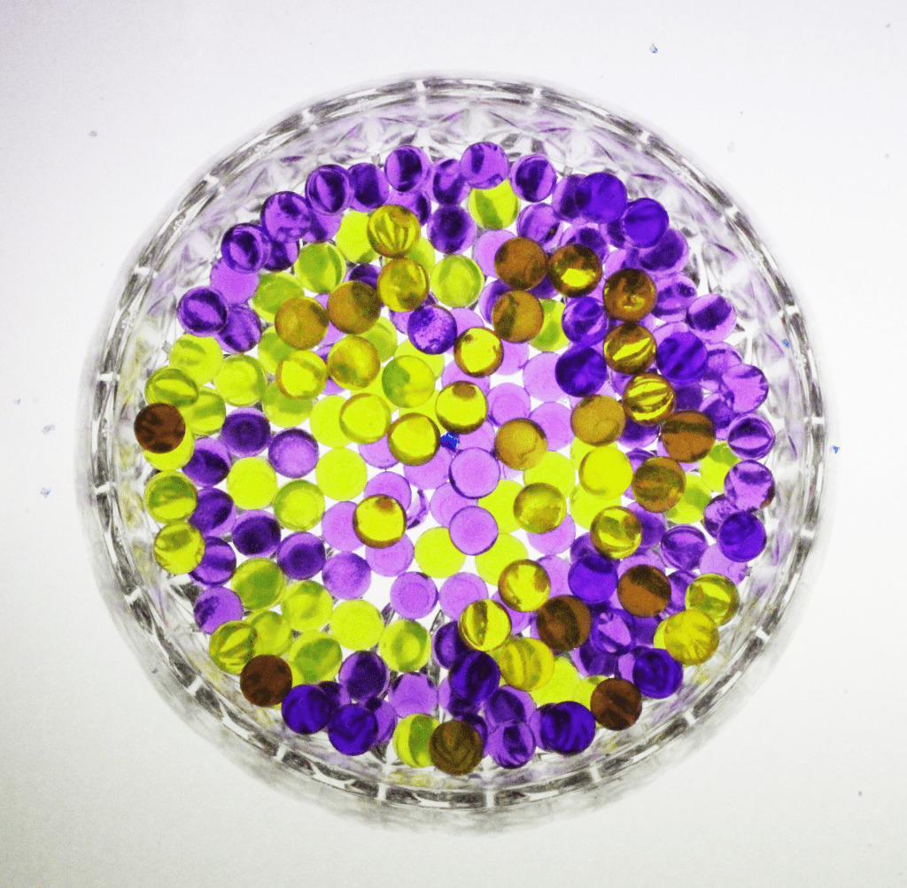
I liked the use of only 2 colors. This shows that it is not distracting, and I like how they are mixed together. The cropping is also great, putting the bowl right in the middle.One thing that could be better is the editing. Some parts, and I don’t know if this was intentional, the balls look brown instead of yellow, making it look oversaturated. One piece of advice is to always have the lighting right. When you are editing, the light changes everything because even if you make it lighter or darker in photoshop, the picture will stay the same in some places, just looking darker.
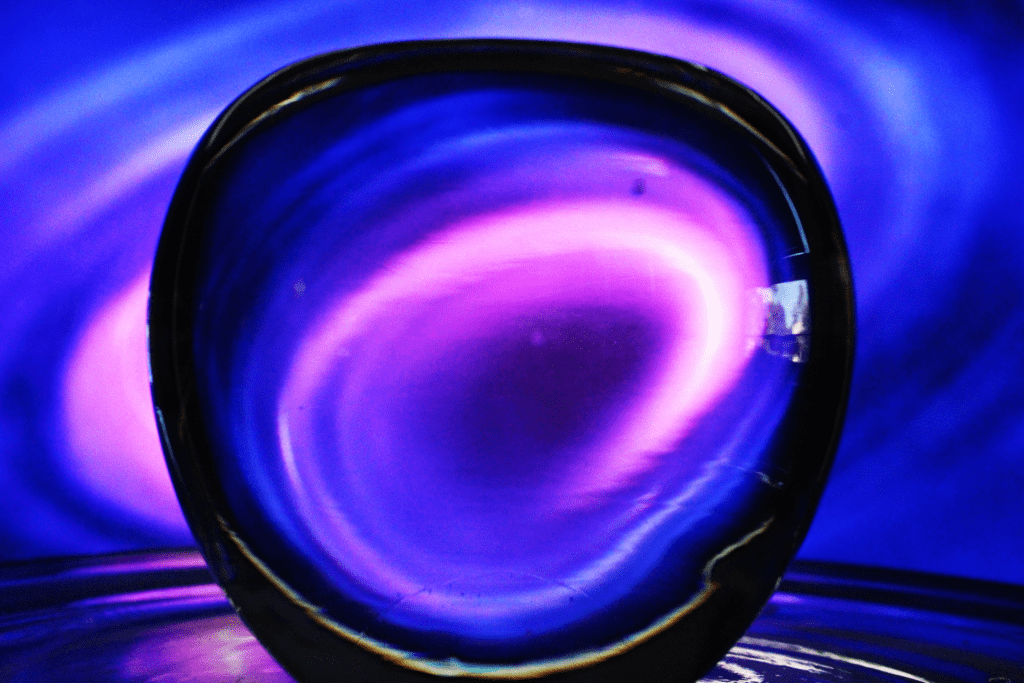
I love the colors. You did a very good retouch on the photo. I also think it looks like a black hole which is sick. I think one thing is the blurriness. It can be fixed by steadier hands. Other than that the photos are great. One piece of advice is to try different lenses. Sometimes the different lens could be better. I think you’re a good photographer.
I love the colors. You did a very good retouch on the photo. I also think it looks like a black hole which is sick. I think one thing is the blurriness. It can be fixed by steadier hands. Other than that the photos are great. One piece of advice is to try different lenses. Sometimes the different lens could be better affected. I think you’re a good photographer.
I like the colors in the photo because they make a good combination. I like the way he used the toothpick to mix the colors and to make a cool pattern between them. I also liked that he used the soap and it made cool bubbles.
I think that the oil could be better. I think if he used the toothpick he could have moved the oil around and created more patterns. Other than that it was a good photo.
I wouldn’t have any specific advice. I would just say to make cool patterns to enhance your photo. OTher than that Great photo.
I liked how in this photo he used a variety of water bead colors. This photo looks really well with the color pop effect. The photo is beautiful and lively due to the variety of colors that were used in the photo.
One thing that could be better in the photo if there was an extra element to it. If he adjusted the lighting I feel like this photo would be close to perfect. Overall, he should have either adjusted the blur or the lighting of this photo.
One piece of advice that I would give to these photographers to make this photo better would be to make the lighting brighter. This would make the colors pop even more. It would also be a small detail that would go a long way. Another piece of evidence would be to use brighter colors to make the picture more attractive.
I like how you mixed blue and green to make a darker color. Then incorporating the oil magnifies the colors. Overall the mix between the darker colors and the oil make the picture really pleasant to look at. This is a minor change but just a better angle. The angle for the current photo is good but utilizing and exploring other angles can intensify the photo even more. I also saw you cropped the photo a bit so that makes the photo look a little uneven have the photo in the shape of the glass to make the overall shape of the photo better. If you intended for the colors to be more accumulated, and not “fighting,” all I would suggest is to mix the colors more. Overall the photo looks better and I’d say it looks better than anything else that was intended. The photo generally looks really nice, though.